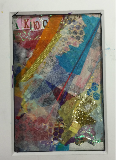
This project is a mixed media. Mrs. Rossi told us to have a theme that tied into our piece, but I ended up not doing that. I thought that it required too much thinking if I were to do a theme. I'm glad I didn't go along with a theme because I really like the way it turned out. The first thing that pops out at me when I look at this piece is the cards. The way they are cut and lined up really makes a statement at the top of the piece. I started out with warm colors like red, orange and yellow. When I kept doing more and more layers I ended up adding different blues, light pink, and white. I tried to keep most of my lines going the same direction to make the piece more visually appealing, and I also incorporated the circles throughout my mixed media as well. When I look at this piece the mood I feel is happy or chirpy. The yellow and gold I used has a lot to do with that because if I had not used those colors it wouldn't be as light. The best part about mixed media is wall the textures you can use. I used sparkles, gold wiring, lace, and string. This artwork is not really supposed to mean anything because like I said before there is no theme and there is no reason for why I put certain things on the piece. I think this artwork has strong value with the cards and the sparkly clear stuff on top of it. I also think that that the red thin cut of paper next to the purple string really emphasizes the way I was intending the lines to all go.